Fill out the form to get more information about the Fullstack Academy bootcamp of your choice.
08.31.2023
How to Create an Impactful Portfolio Website (Plus 10+ of Our Favorites)
By The Fullstack Academy Team
No matter where you’re at in your career, it’s always important to have a good place to show off your work and projects you’ve collaborated on, what you like to do, and your professional goals.
A portfolio website makes it easy. You can easily customize it to your needs and keep it updated, attracting recruiters and connections alike as you grow your network and establish credibility in your field.
If you don’t already have a portfolio website though, it can be hard to know where to start. Apart from including your name, a way for people to contact you (either through a form submission or your email), and your résumé, the 3 tips below will help you plan what your site will look like and inspire you to go the extra mile.
3 Tips to Creating an Impactful Portfolio Website
- Have fun with it! Show off your personality and give visitors a good idea of your background and skill set, in addition to what you’re passionate about. For bonus points, come up with a clever URL that relates to your profession like these web developer personal websites: Molly Lupton’s mollythecoder.com or Marielle Combier-Kapel’s mariellecodes.com.
- Incorporate movement and high-impact visuals. We love how Joshua Grossman’s site opens with a beautiful font and logo treatment, and you can’t beat Chelsi Asulin’s roving eye. Consider menu navigation, fonts, and colors and how they impact the overall look and feel of your site too.
- Don’t forget your portfolio favicon! It makes your site stand out, look more professional, and proves that you’re detail-oriented. It’s an easy way to go the extra mile.
Now that you have the basics down, get inspired by some of our favorite portfolio sites from Fullstack Academy students, alums, and instructors.
10 of Our Favorite Portfolio Sites
1. Noelle Laureano
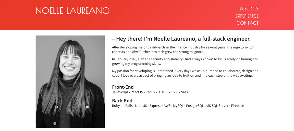
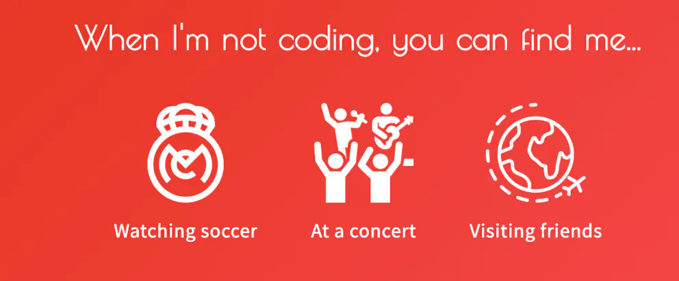
Noelle Laureano is a graduate of Fullstack Academy’s software immersive program and served as a teaching fellow for the Web Development Fellowship. Her experience section is structured like a timeline, and her site is chock-full of personality—everything from her font choice to the bold shade of red that features throughout (not to mention the Spotify playlist) gives us a good idea of what it’d be like to work with her. We also like the icons she has to represent her interests outside of work. “When I was designing my site, I searched the internet for inspiration from other people’s portfolios and combined aspects that I liked to make my own,” Noelle says. “Having a portfolio site definitely helped me land a job.”
2. Jesen Tanadi
Jesen Tanadi is a Fullstack Academy alum with a background in graphic design and architecture. His site has clean lines and bold graphics, highlighting his background and experience. He also makes it easy to access his résumé and email by featuring them at the top of the page. “Even though my projects are on GitHub, I think it’s easier for potential employers to navigate through a small curated (and visual) list than having to check out all of my repos,” Jesen says.
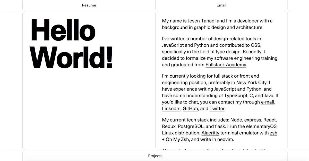
When he was considering the design of his site, he wanted it to be simple. “I decided that instead of having a lot of moving parts, my portfolio should just act like a portal to my projects, résumé, GitHub, etc.”
3. Chris Chin
Fullstack Academy alum Chris Chin’s portfolio site is a sleek and engaging example of how to set up a portfolio website. The design is simple, with bold font choices and a good-looking logo and favicon.
“I wanted to create a portfolio website to showcase the skills that I have acquired while attending Fullstack. I also wanted to improve my front-end skills, specifically in CSS, so creating a personal website is a great way to do that,” Chris says.
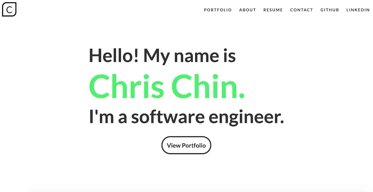
“I wanted to create a responsive site that looks great on both mobile and PC. I chose to incorporate animation-on-scroll effects and a sans-serif font (Lato). I utilized whitespace and a simple color palette for a minimalistic modern look.”
4. Claire Filipek
Grace Hopper grad Claire Filipek is an NYC-based web developer, designer, and fine artist. We like her portfolio website because of how easy it is to contact her and that her projects are featured on the front page.
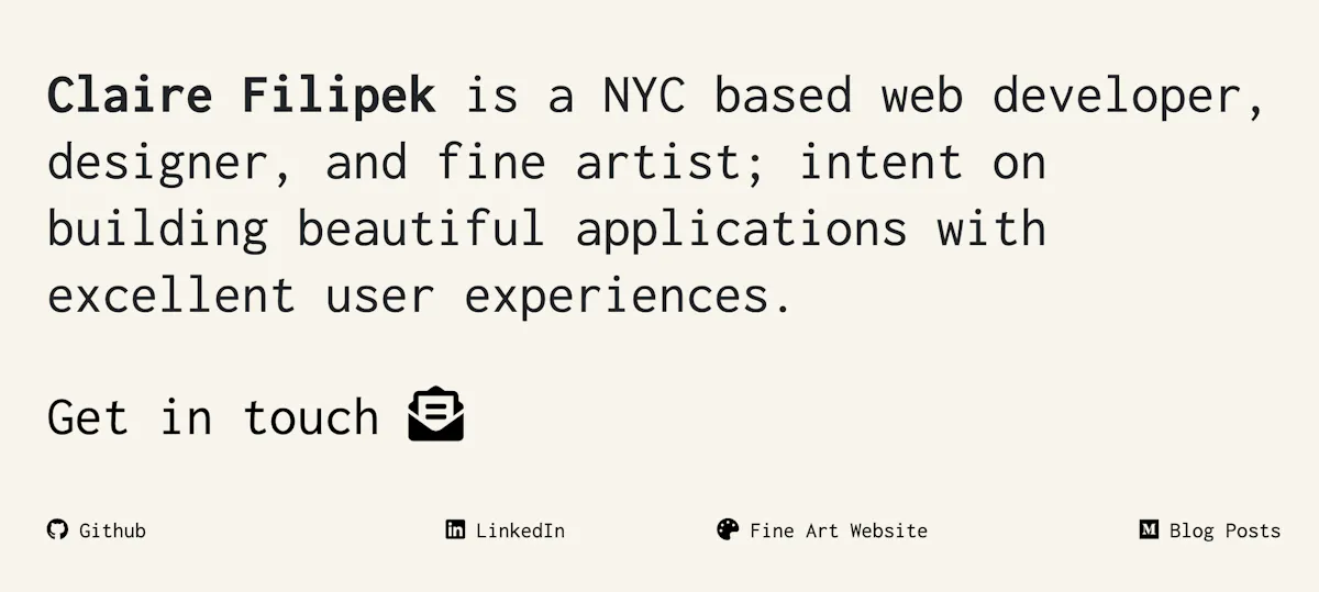
“I weighed several factors in the design of my portfolio website. First, I wanted to keep it simple and optimally a repository for my projects and links out to my professional web presence, such as my Github, LinkedIn, and Medium articles,” Claire says. “I also wanted the design to contrast with my previous websites designs, particularly in the navigation. Thus I purposefully decided not to use a typical navbar and instead have arrows leading back from project pages.”
5. Megan Donnelly
Current Grace Hopper fellow and Fullstack Academy alum Megan Donnelly is a fullstack software engineer with a background in marketing and quality assurance. Her site is bright, with an NYC theme, and effectively highlights her projects and experience. Her logo is a nice touch, too! “Portfolio sites are an opportunity for developers to show their personality and highlight their strengths. When I was designing my portfolio site, I knew I wanted to try to make my site visually interesting without detracting from the content of the site,” Megan says.
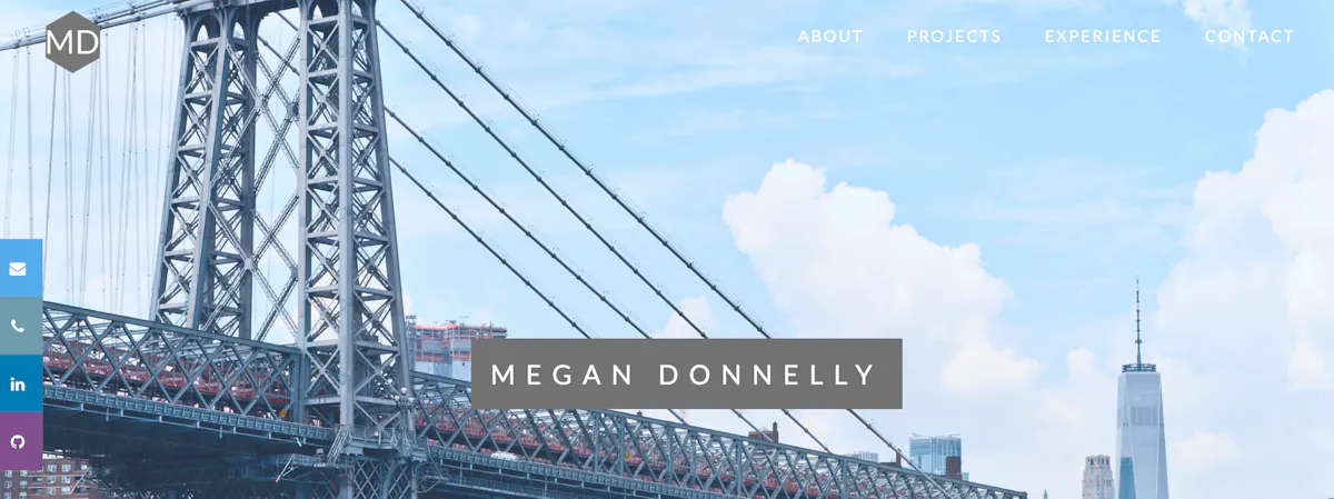
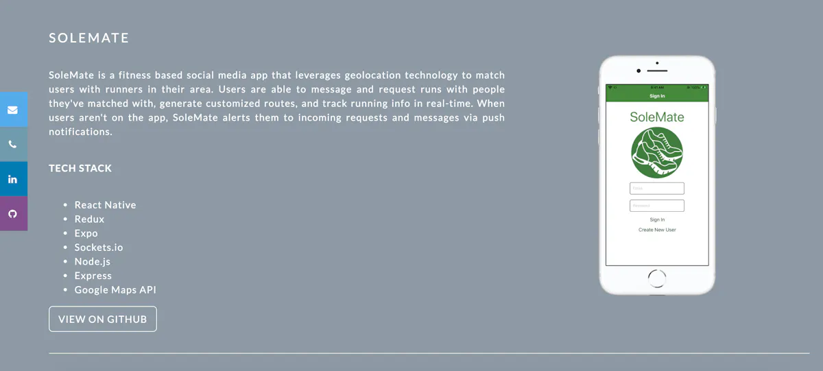
She decided to separate each section of content with parallax scrolling background images, while using neutral background colors for the content itself. She also wanted to highlight her projects. “I gave each project a detailed description of how it works, the tech stack used, and an image of the application, as well as a link to the Github repository where users can review the code and try the application for themselves.”
6. Zach Caceres
Fullstack alum Zach Caceres is a software engineer focused on modern web technologies like React, GraphQL, and serverless computing. When it comes to creating a portfolio website, he says, “Building a great portfolio is critical to standing out in the world of software development.”
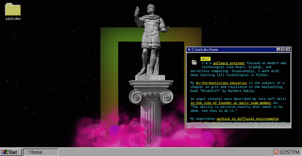
His site has a retro feel with a unique navigation menu and site format. On the design of his site, Zach says, “Zach.dev draws inspiration from aesthetics like cyberpunk and vaporwave while also channeling the nostalgia of Windows 95/98 (the operating systems I used as a kid).”
In addition, he notes the importance of collaboration when it comes to bringing your vision to life. “I worked with designer Felipe Lebrun to help me shape the creative vision. He immediately understood the aesthetic I wanted to build,” Zach says. “If a developer wants to make a distinct portfolio and doesn’t feel confident in their visual design skills, I recommend finding outside help.”
7. Caoimhe Morgan-Feir
Caoimhe Morgan-Feir, a Grace Hopper alum who now works at Quantum Mob, started her career as an online editor before discovering that coding was her true passion. Her site is fun and relates back to her art background, using colorful links and custom fonts to share her story.
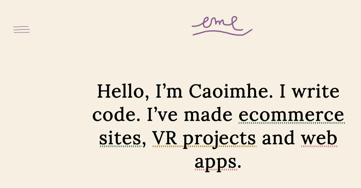
“When I finished the Grace Hopper Program, I wanted to bring together all the projects I’d worked on in a simple location to share with employers and friends,” she says. “It seemed like no-brainer opportunity to not only promote my work but also to highlight my eye for design and to learn how to replicate some of the effects I’d seen and liked on other websites. I’ll continue to return to the portfolio site, tweaking and improving it as I gain experience.”
8. Scott DeMeo
Fullstack New York alum Scott DeMeo’s portfolio site is a great one to bookmark if you like clean, streamlined design. “Having a tailored showcase for your work means your exposure to hiring managers is completely under your control. It also cements your personal brand and helps to set you apart from the rest of the pack,” Scott says. The opening page features a nice visual that shares his interests in addition to his career summary. We also like the use of side navigation menus.
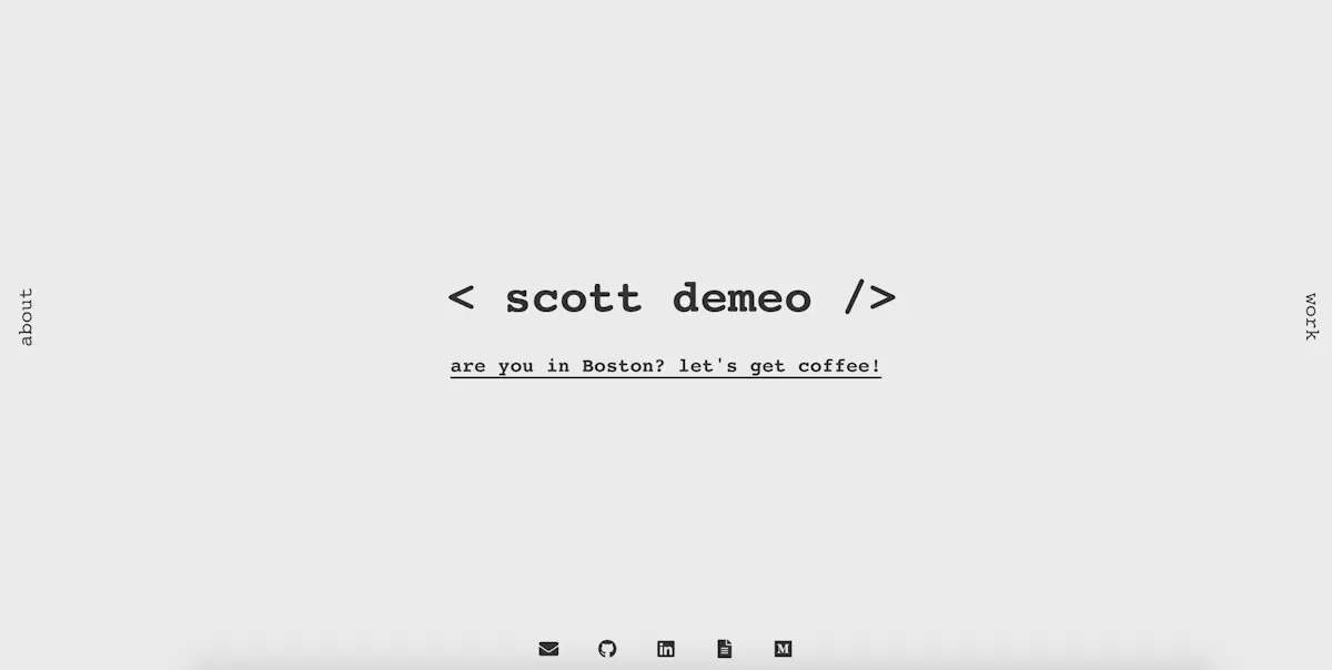
When it came to designing his site, Scott says, “I remember looking at some more high-profile developer sites, taking note of elements I liked, and trying to marry those with some other aesthetic/personal design choices.” He also notes the importance of adding analytics to your site. “Many quality bundles are free (in the Google sense of the word), easy to add, and inject some levity into the job search,” Scott says. “I feel a little spark of joy every time someone in NYC checks out my site. You never know—that little data point could lead to your first job as a developer.”
9. India Amos
India Amos’s site is a great example of how to use coding in a fun way to make a standout portfolio site. Her use of color and a unique header make for a site that’s hard to forget. “Before attending Grace Hopper, I was a designer and art director, but I ultimately decided to take anti-designy approach with a 1980s PC aesthetic and build it as a static site in Jekyll, which I’d used at a previous job,” India says. “Setting those constraints helped me let go of perfectionism and focus on content.”
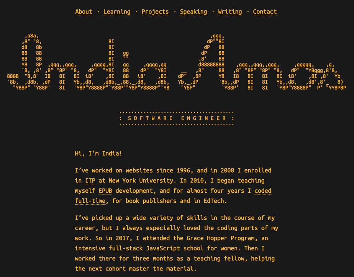
When she started deciding what to include on her site, she surveyed other developers’ websites and made notes on what kind of information each contained and how it was organized. “Once I had a prototype, I went to a Portfolio Prep Workshop that was hosted by Women Who Code NYC. There I met with someone who gave me advice about copy and organization,” she says. “I include a lot of text on my portfolio site—an overwhelming amount, to some people—so there’s both a short and a long version of my bio, and I try to keep everything skimmable, with lots of subheadings and bullets.”
10. Céline Cholé
Current Fullstack instructor Céline Cholé’s portfolio site is straightforward and easy to navigate. We like her use of arrows and icons throughout to create a simple, beautiful site. She also has a great selection of student resources in her main menu.
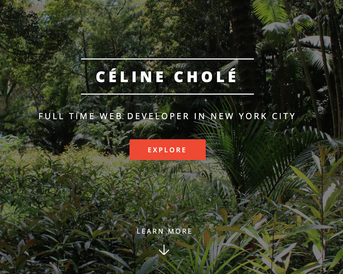
“I personally like when portfolios are more than just few links. I like to read about technologies used for projects and what people would change if they started again,” Céline says. “I tried to make my portfolio website one that I'd enjoy reading.”
When it came to the design of her site, she decided to use a template with GatsbyJS, a static site generator on React. “I spent time customizing it to suit my needs and making sure it told my story,” she says. “The front page is fairly simple, which allowed me to use my photographs to create a contrast between the concrete jungle (NYC) and the real jungle!”
Want more inspiration? Here are a few more portfolios to check out:
Interested in more career advice? Learn how to create a professional-looking front-end developer résumé and how to conduct a successful job search.


